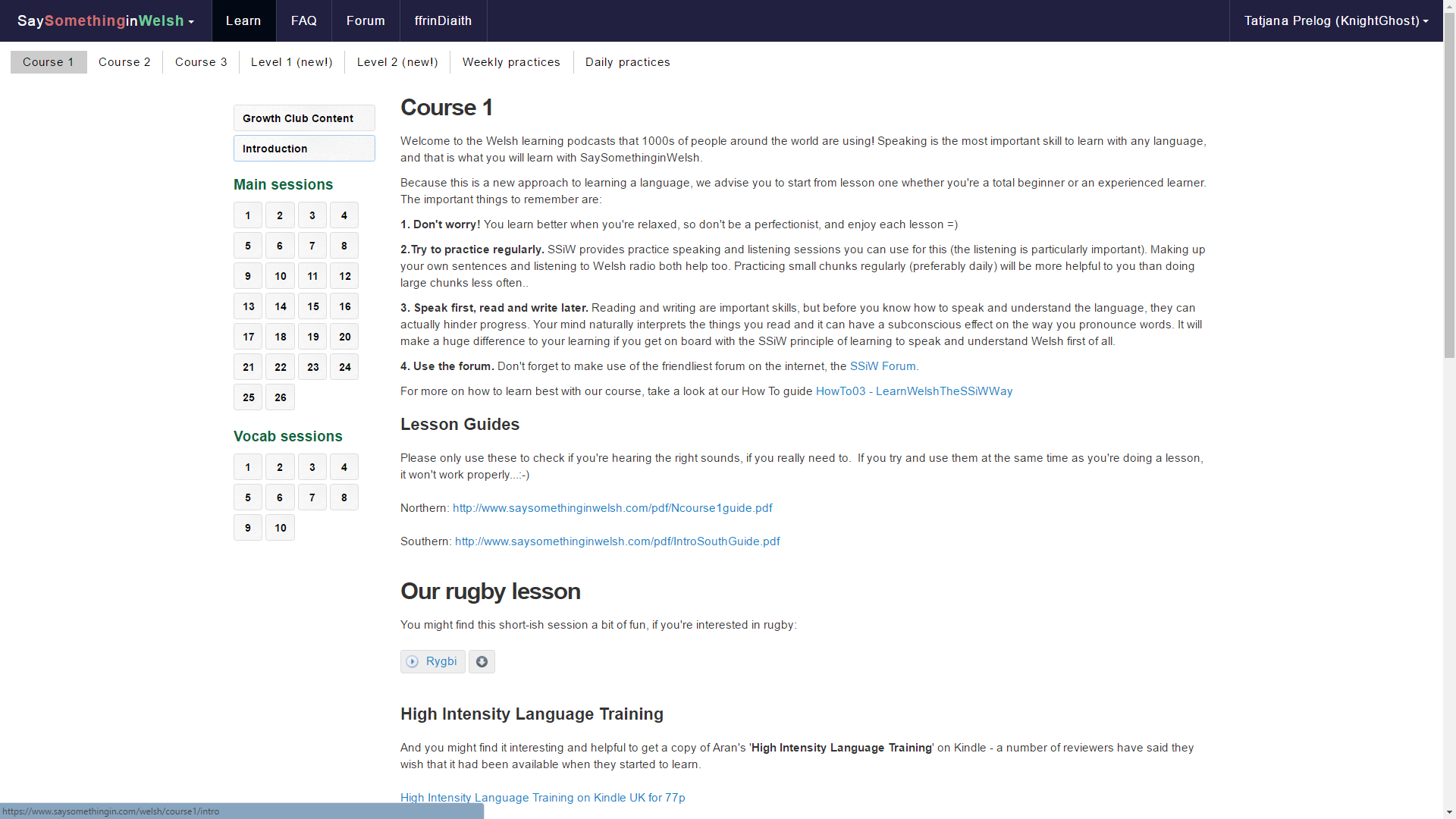
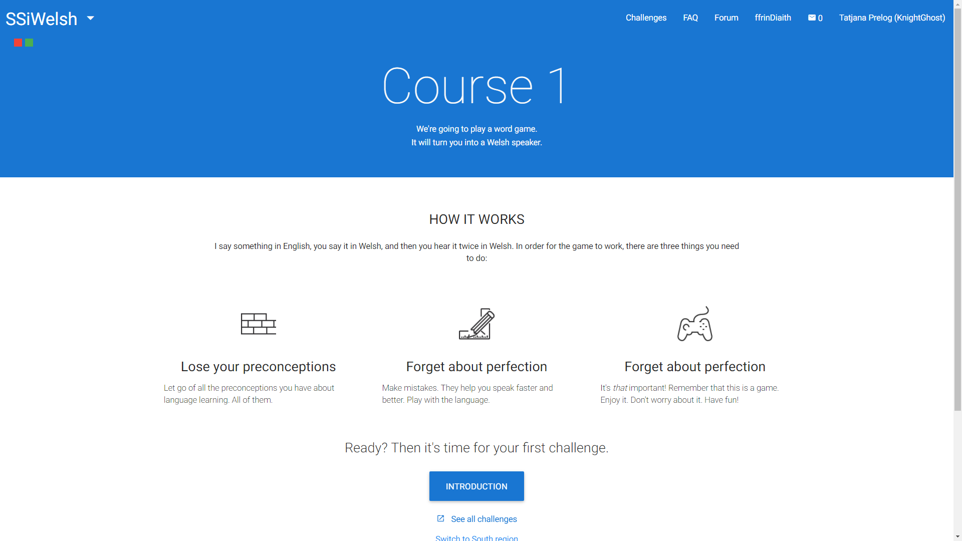
and to @tatjana and @Kinetic and @aran
I am very confused. I am, I think, in new format. When I log on I am in Spain, where I do not want to be. Every time I switch to Welsh. All seems OK, but I looked at my Profile and it is nothing like examples above!! I’m not sure how to send it!
My attempt failed dismally.!
I haven’t seen the famous switch!
I am on a laptop.
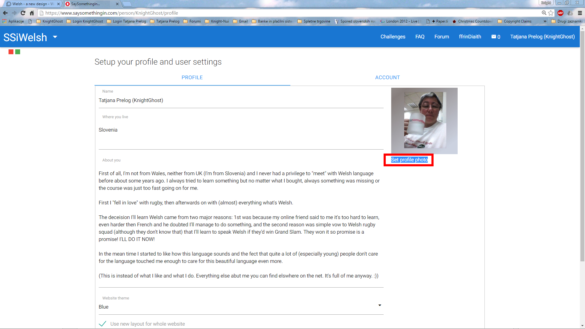
On a laptop the profile is as on the PC, like this:
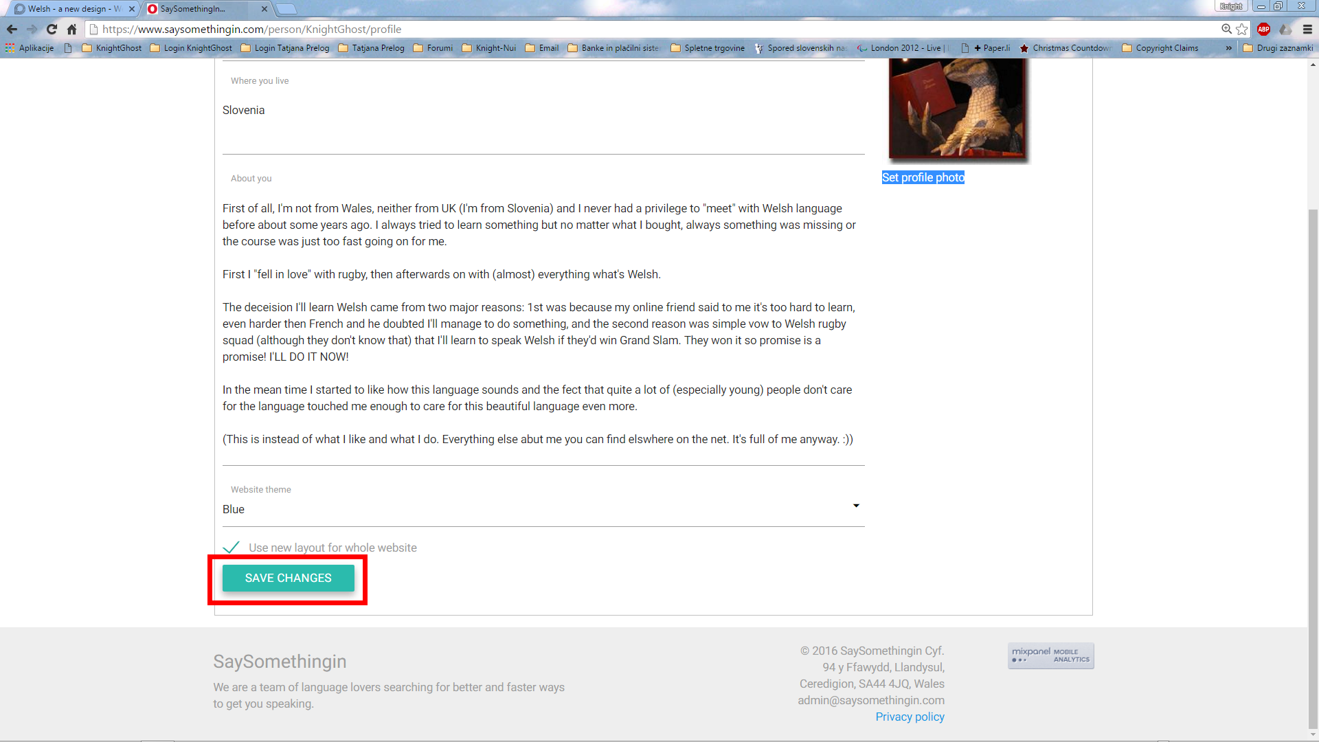
and switch is beneath the whole thing in profile.
I’m every time on Cornish side of the thingey when logging in but I’ve got used to it already so there’s no problem, however I believe there’s not much to do on this matter as we constantly have those problems of being where we don’t need (deliberately said need not want) to be at the moment.
I’m sorry, I can’t be in more assistance here to both, you @henddraig and you @Deborah-SSi, but this really is the work for @Kinetic obviously.
Not your fault and mine looks nothing like that!!
Dee, if you could tag @kinetic on these kinds of post, it’ll get you onto his workflow… 
Hmm that’s rather odd… clicky clicky …oh. clicky
How does it look now, @Deborah-SSi / @henddraig? 
Yippee! It’s those magic clicks that did it!
Sorry I didn’t tag you, but I thought you were probably getting a load of prompts from others here tagging you already 
You’re meant to say ‘Oh, never mind Ifan, it seems to be working okay now anyway…;-)’
I just imagined him sitting there clicking his fingers and Hey Presto, job done! ![]()
Hmmm … well, I presume he obeys only his Master and the Master’s servants. - hehe ![]()
[size=10]Hope you all undestand my joke though … [/size]
I am so sorry. I am at a loss. When I click on my picture, I get options. The first is profile and that gives me a list of what seems to be every message I’ve ever written!!! I tried ‘Preferences’ which seems to give my profile, which is largely empty because I haven’t ever bothered with it. I do not seem to have the famous ‘click box’ at the bottom! Messages gave me the PMs.
This sounds as though you’re visiting your forum profile, rather than your site profile (in an ideal world, we’d be able to merge them, but with the forum running on different software that’s a bit tricky).
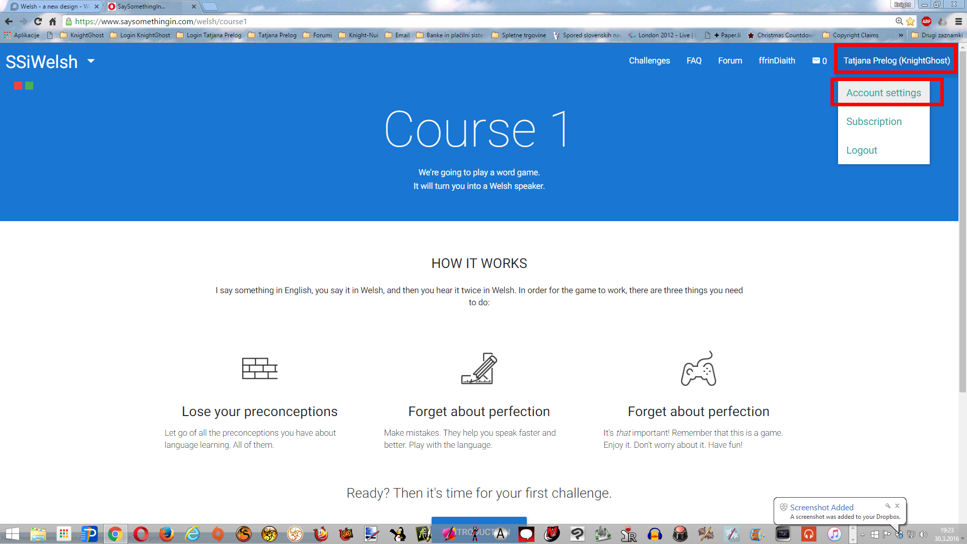
If you start by clicking on ‘Learn’, and then click on your username in the top right hand corner, it should all look more like what Tatjana has been showing you… 
@henddraig you have to go to LEARN page not FORUM one according to have new design. The new design is not available for the forum though but ONLY for the learn page and that one profile, not profile here.
EDIT
Oh, but I saw even later on that @aran already explained all this. However we in Slovenia say: “Bolje dvakrat kot nikoli.” (Better twice then never.) Hope you’ve found the right profile now.
Enjoy.
and to @aran Diolch yn fawr iawn i chi!
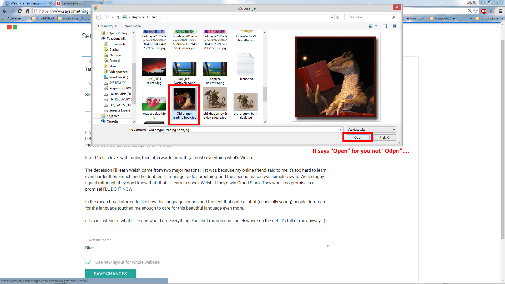
Found it!! (Not at first, found it under ‘account settings’) In this version of my profile the ‘photo’ is the old blue and white design. @tatjanafach, how do I get my dragon there? I am not sure it is anywhere I could find it other than my profile in the Forum!
It doesn’t matter at the moment, because the Forum uses the dragon, but I guess in future all will become new and I don’t want my draig to fly away suddenly!!
I have safely stored it in my computer so if it flies away I’ll bring it back. 
Then on, you do the same as you did on forum profile.
And no, I don’t have that picture on my Learn profile. I’ve changed it back to what it was before … 
Thanks a lot! I found my copy of ‘my’ dragon and it is now in my Learn profile!!
Mind, when I am on the first page of Learn, I don’t get the list along the top 'Challenges FAQ etc". I have to click on three lines on the left hand side to get the options! I don’t know how to show you what I get!!
That sounds as though you’re using a phone or a tablet to access the site, and things are having to be compressed to fit the available space - the ‘three lines’ are an increasingly common sign (mostly on mobile devices) to indicate a menu is available…
I am using a laptop with a wide screen. I am not yet running Windows 10 despite it trying to make me!! I don’t like change!! ![]()
Oh, hang on a moment - what do you mean when you say ‘the front page of Learn’ - are you on the new design? There isn’t a ‘Learn’ tab on the new design, it’s just ‘Challenges’…
Press tab Pt Sc (Print Screen) and then paste the photo with CTRL+C into the post window here. The picture will upload automatically.
EDIT
I actually don’t know from where you get 3 dots at all. Well I’m using Windows 8 and it was the same before using Windows 7. When I put to full screen I get
I’ve heard interesting thng today when talking to @brigitte. She said that she went to Spanish side the other day and there of course if new design available to all and the old is not anymore, however she says that now she has new design to every language she goes but she did never apply to have the new design. And even more interesting, she doesn’t have the switch to switch the design back to old either.
I went to the learn page not being logged in to test if new design might be in place for all already, however there’s still old design in place so this is really interesting.

